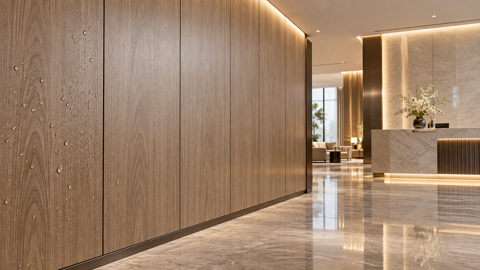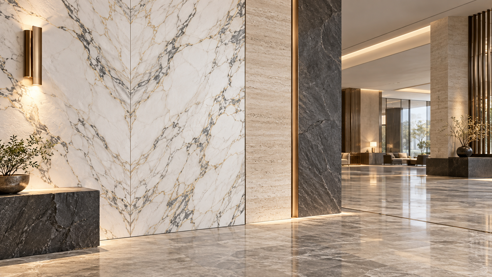



What Stone-Texture Finishes Are Available for Luxury Wall Panels?
Luxury wall panels can reproduce a wide range of stone appearances, but the finish name alone does not determine whether a panel will look convincing, perform safely, or suit a particular interior. Marble, travertine, limestone, slate, granite, onyx, and concrete-inspired surfaces are all commonly specified as stone-texture directions. The meaningful differences lie in pattern scale, surface relief, gloss level, colour consistency, panel joint treatment, and the substrate behind the decorative face.
For hospitality, high-end residential, retail, and commercial interiors, the strongest result rarely comes from choosing the most dramatic stone image. It comes from matching the visual language of the finish to viewing distance, lighting, touch frequency, room humidity, fire requirements, and the practical need to replace or reorder panels later.
Marble-look finishes: veining, depth, and pattern control
Marble remains the most requested stone-texture category for luxury interiors because it can communicate formality, brightness, and material richness without requiring the structural loading, sealing, or breakage management associated with large natural slabs. Within decorative panels, “marble-look” covers several distinct visual families.
- White marble: White or warm-white grounds with grey, beige, gold, or charcoal veins. These finishes are used where the design requires a clean, spacious appearance, such as reception walls, lift lobbies, vanity backdrops, and suite entry areas.
- Calacatta-inspired marble: Characterised by broad, more expressive veining, often with gold or warm-grey tones. It creates a focal surface but requires careful pattern matching across adjacent panels.
- Carrara-inspired marble: Generally softer and more clouded than Calacatta patterns, with fine grey veining. It works where a restrained classical stone appearance is needed.
- Dark marble: Black, brown, green, blue-grey, or deep burgundy bases with high-contrast veins. These finishes suit feature walls, bar fronts, executive spaces, and areas with controlled lighting, but can make narrow corridors or low-light spaces feel visually heavy.
- Book-matched marble: A mirrored vein layout across two or more panels. This can create the visual effect of an opened stone slab and is often specified behind reception desks or in private dining rooms.
The central specification issue for marble-look panels is not simply colour. It is repeat management. Natural marble contains irregular variation; a decorative panel system may use a repeating print or film. If the repeat is short, a large wall can reveal duplicated veins or identical cloud formations. This is especially noticeable in lobby walls viewed from several metres away. Buyers should request the full repeat dimensions, panel elevation drawings, and the intended vein direction before approving production.
Surface treatment also changes the perceived quality. A high-gloss face can suggest polished stone, but it may reflect downlights, show fingerprints, and exaggerate slight wall unevenness. A satin or low-sheen finish is more forgiving in circulation spaces. Embossed marble textures may add tactile interest, yet heavy relief can look less natural when the intended reference is a polished slab. The relief should reinforce the visual print rather than contradict it.
Travertine finishes: the quiet luxury option
Travertine-inspired panels are defined by elongated pores, layered bands, and warm mineral tones rather than sharp veining. They are available in ivory, sand, cream, beige, taupe, silver-grey, and darker walnut-brown interpretations. The direction of the bands matters: horizontal layouts can visually widen a wall, while vertical cuts can make a low ceiling appear higher.
Two visual approaches are important. Filled travertine presents a smoother face, similar to stone whose natural voids have been filled and honed. It is often easier to use in refined, contemporary interiors because dust does not visually collect in deep cavities. Unfilled or open-pore travertine uses more pronounced pits and voids, creating a rustic or tactile surface. In panel form, this effect may be achieved through embossing, printing, or a combination of both.
Open-pore texture should be assessed beyond its appearance. Deeply embossed surfaces can be harder to clean in restaurant corridors, vanity zones, or high-contact public spaces. Where the panel will be illuminated by wall washers, the depth and direction of embossing become highly visible. A sample viewed under diffuse showroom lighting may not predict the same result under the project’s final lighting scheme.
Limestone and sandstone: softer mineral character
Limestone-look finishes tend to have a more uniform mineral field than marble. Their appeal is subtle variation: fine fossils, muted clouding, granular specks, or soft tonal shifts. They are suited to interiors where natural material character is wanted without strong veins competing with furniture, artwork, signage, or decorative lighting.
Sandstone-inspired panels usually show a more granular structure and warmer colour movement. Buff, camel, ochre, mushroom, and pale grey are typical directions. These finishes can support biophilic, resort-oriented, or regionally grounded design concepts, but a strong sand grain should not be assumed to offer abrasion resistance. The visible texture and the protective wear layer are separate attributes.
For both limestone and sandstone effects, the risk is excessive uniformity. A completely flat beige print may read as painted board rather than stone. More convincing finishes generally include restrained tonal depth, varied particle size, and a matte surface that diffuses light. At the same time, exaggerated fossil graphics or overly dark joint lines can make a wall appear artificial at close range.
Slate, quartzite, and split-stone effects
Slate-look finishes offer a more architectural and tactile alternative to polished marble. They commonly use charcoal, graphite, rust, olive, silver-grey, and blue-black colour palettes, with cleft layers or stratified mineral lines. Quartzite-inspired surfaces may include more pronounced crystalline movement and linear banding. These options are frequently chosen for feature walls that need visual weight without the mirror-like reflection of polished stone.
The main distinction is between a flat slate graphic and a split-face or riven texture. Flat graphics are easier to clean and can work well on large wall areas. Split-face effects add shadow and tactile depth, but their irregular surface makes panel joints more difficult to conceal. The joint may interrupt the stone texture, especially where the design seeks the appearance of continuous stacked stone.
Panel suppliers should clarify how corners, reveals, columns, and access doors will be finished. A natural split-stone effect can lose credibility if a thin printed edge is exposed at an external corner. Matching edge bands, folded panel construction, mitred corners, or purpose-designed trims may be needed, depending on the panel format and site tolerance.
Granite, terrazzo, and engineered-stone visuals
Granite-look wall panels generally use a dense granular pattern rather than dramatic veins. They can create a durable, institutional, or contemporary luxury impression, particularly in darker tones. Fine-grain patterns often work better on walls than large, high-contrast aggregate because the latter can become visually busy across broad surfaces.
Terrazzo is not natural stone in the strict geological sense, but it is frequently included in stone-texture panel collections. Its appearance is based on mineral chips in a binder-like ground and can range from fine, restrained speckling to bold multicolour fragments. Terrazzo-look finishes are useful when a project needs more movement than limestone but less formality than marble.
Engineered-stone and sintered-stone visuals occupy a similar space. These typically feature controlled veining, granular fields, or mineral layers with more regularity than quarried stone. Their advantage in decorative panel design is predictability: designers can specify a repeatable appearance across rooms and future phases. Their limitation is that regularity can look manufactured if the pattern is overly symmetrical or if every panel is installed in the same orientation.
Concrete and mineral-plaster finishes
Concrete-look panels are often grouped with stone textures because they rely on mineral visual cues: pores, trowel marks, tonal clouds, formwork traces, and cement-like variation. They range from pale microcement and warm greige plaster to dark industrial concrete.
These finishes should not be selected only for an “industrial” aesthetic. In a luxury setting, the relevant question is whether the concrete effect has enough tonal restraint and material depth to complement refined joinery, metalwork, and lighting. Overly graphic cracks, exaggerated stains, or repetitive trowel marks can make the surface feel theatrical rather than architectural.
Concrete-look panels are often useful where real cementitious finishes would introduce drying time, cracking risk, inconsistent hand application, or difficult repair. However, a panel does not reproduce every quality of cast concrete. Deep cast marks, sharp form-tie holes, and irregular edge transitions may need custom detailing rather than a standard printed face.
Onyx and translucent stone effects require a different specification
Onyx-inspired finishes use layered translucency, saturated mineral colour, and bold internal movement. Amber, honey, jade, smoky grey, and white are common visual directions. Their value is usually tied to backlighting. Without controlled illumination, an onyx print may appear simply as a high-contrast decorative pattern.
A backlit stone-effect panel must be assessed as a system: decorative face, diffuser, lighting layout, heat management, access for maintenance, and the visual consistency of the illuminated field. Light-source spacing can create visible hotspots. Panel seams may become more noticeable once illuminated. Colour temperature also changes the perceived stone colour; warm light can enrich honey tones while muting cool whites and greens.
Where a project specifies an onyx effect, it is useful to distinguish between a non-translucent wall panel with an onyx graphic and a purpose-designed illuminated panel assembly. They serve different design intentions and should not be compared as interchangeable products.
The finish is only one layer of the wall-panel decision
A stone-texture wall panel is not defined by its decorative surface alone. A procurement specification should separate at least five elements: the face finish, protective coating or overlay, core or substrate, backer or balancing layer, and edge or joint treatment. Two panels with nearly identical marble graphics can differ substantially in stiffness, impact resistance, moisture behaviour, dimensional stability, weight, installation method, and fire performance.
This distinction matters particularly in hotel and public-commercial projects. Corridors, guestrooms, bathrooms, restaurants, lift lobbies, and reception areas place different demands on the same visual finish. A decorative panel selected for a dry guestroom headboard wall may not be appropriate behind a buffet counter, beside a wash basin, or in an escape route without confirmation of the complete assembly’s performance.
Fire classification should never be inferred from a stone appearance or from the presence of a nominally fire-resistant core. Requirements vary by jurisdiction, occupancy, installation height, substrate, adhesive, cavity construction, and whether the panel is part of a tested wall system. Project documents should identify the applicable local code and request evidence relevant to the supplied configuration, rather than relying on generic statements about “fireproof” panels.
How texture is created affects maintenance and consistency
Stone effects are commonly produced through printed decorative papers, films, digital printing, laminate surfaces, coated boards, or composite panel faces. The method is less important than whether it delivers the required visual fidelity and service performance. Digital printing can support project-specific artwork, colour adjustments, and panel mapping. Laminated or continuously produced surfaces may provide consistency for repeatable standard finishes. Each approach needs sample approval at the actual intended scale.
Texture may be visual only, mechanically embossed, chemically etched, or created through a coating system. The more pronounced the physical texture, the more closely maintenance requirements should be reviewed. Matte surfaces can reduce glare, but some soft-touch or ultra-matte coatings may be vulnerable to unsuitable cleaning chemicals. Deep grooves can retain dust. High-gloss surfaces may require more frequent cleaning to maintain their appearance.
Cleaning protocols should be aligned with the panel supplier’s documented guidance. Harsh abrasives, strong solvents, bleach-based products, or aggressive descalers can damage certain decorative faces and coatings. For projects with housekeeping operations, this is not a minor handover detail; it is part of the material’s expected service life.
What to verify before approving a stone-texture panel
Small hand samples are useful for initial colour selection but insufficient for final approval. Stone-pattern panels should be reviewed using larger samples or a controlled mock-up, particularly when the design includes book-matching, continuous veining, directional travertine, or large-format dark surfaces. The review should include the proposed lighting, adjacent materials, actual joint width, and the planned panel orientation.
Colour control deserves particular attention. A finish approved from one production batch may show visible tonal variation when reordered later, especially where printed décor, coatings, or different substrate lots are involved. Project teams should establish the approved reference sample, define acceptable batch variation, record orientation rules, and reserve enough material for likely repairs where continuity is important.
For hotel projects, custom decorative panel capability is most useful when it resolves a real coordination problem: adapting the pattern scale to room dimensions, mapping veins around a reception feature, matching a specified colour palette, producing coordinated trims, or designing a panel layout around service access. Shengshi Meilin custom decorative panel capability for hotel projects is relevant in this context not as a substitute for specification discipline, but as a means of aligning a decorative surface with the project’s drawings, operational demands, and material-control requirements.
The most reliable choice is therefore not “the most luxurious stone finish” in isolation. It is the finish whose pattern, texture, sheen, construction, tested performance, detailing, and maintenance profile remain coherent once installed across the full wall area. That is the point at which a stone-texture panel moves beyond imitation and becomes a credible interior material solution.
RECOMMEND

Sep 29, 2026
How Reliable Is Meilin Board for OEM Commercial Interior Panels?
Fireproof waterproof composite wall panels for commercial spaces: discover how Meilin Board supports reliable OEM interiors with customizable finishes, quality control, and durable performance.
Sep 29, 2026
What Stone-Texture Finishes Are Available for Luxury Wall Panels?
Shengshi Meilin custom decorative panel capability for hotel projects delivers marble, travertine, and onyx wall finishes tailored for luxury interiors.

Sep 28, 2026
Where decorative panel systems are shaping modular interior design
Decorative Panel Systems are transforming modular interiors with faster installation, flexible design, easier maintenance, and coordinated solutions for residential, hospitality, and commercial projects.
Sep 28, 2026
What to check before specifying high density polymer composite panels outdoors
High Density Polymer Composite Panels: discover essential outdoor specification checks for UV, moisture, fire, structural loads, installation details, and long-term value.