


What affects the realism of wood grain decorative panels
The realism of Wood Grain Decorative Panels depends on far more than surface printing alone. From texture depth and color variation to core materials, coating technology, and installation details, each factor shapes how authentic the finished panel looks and feels. For researchers comparing decorative material options, understanding these elements can help identify panels that deliver both visual appeal and long-term performance.
In the decorative materials market, “realistic wood grain” is often treated as a visual claim, but in practice it is a multi-layered technical result. A panel may look convincing in a catalog image and still appear artificial in a showroom, under daylight, or after six months of use. That gap matters to architects, importers, distributors, and project teams because perceived realism affects product positioning, customer acceptance, and even pricing power.
What makes one panel feel close to natural wood while another looks obviously synthetic is not a single technology. It is the interaction between design, substrate, surface treatment, manufacturing precision, and installation context. For anyone researching the category, that is the more useful lens.
Visual realism starts with pattern design, not just printing resolution
A common misconception is that a sharper print automatically creates a more authentic wood effect. Resolution matters, but it is only one part of the outcome. Natural wood is irregular by nature. Grain lines shift in density, pores open and close unpredictably, and color changes are rarely uniform across a board. When decorative panels repeat the same pattern too frequently, the human eye notices the repetition quickly, especially on walls, cabinet doors, and large commercial surfaces.
That is why pattern engineering is often more important than pure print sharpness. Good wood grain design includes:
- low-repeat or non-obvious repeat cycles;
- variation in knot placement and grain flow;
- controlled randomness in tone distribution;
- alignment between visible grain and tactile texture.
If a supplier offers only a few highly repetitive wood visuals, the panel may still work in small applications, but it will be less convincing in hospitality, retail, office fit-out, or full-height wall systems where repeated motifs become obvious.
Texture depth is what turns a printed surface into a believable material
Many panels fail the “close-range test.” From a distance, they resemble wood. At arm’s length, they reveal themselves as flat printed boards. This is where embossing and surface relief become critical.
Natural wood is not visually flat. Open-grain species such as oak, ash, or walnut show micro-relief. Even smoother species have subtle fiber direction and tactile change. Decorative panels that use synchronized embossing, where the physical texture follows the printed grain, usually appear more realistic than panels with generic or mismatched textures.
The key issue is not maximum depth alone. Over-embossing can look theatrical rather than natural. The better question is whether the surface topography matches the wood species being imitated. Oak-like visuals typically benefit from visible pore structure, while maple-like finishes require finer, quieter texture. When the tactile language does not fit the visual species, realism drops immediately.
This is also why samples should be evaluated under touch, not only by image. A material used in decorative interiors is experienced by hand as much as by sight.
Color variation is often the decisive factor under real lighting
Color is one of the most underestimated variables in wood grain realism. Real wood rarely presents a single flat brown, beige, or grey. It contains undertones, warmer and cooler zones, and small tonal transitions created by growth structure and finishing. Panels with overly uniform color can seem “clean” on screen yet artificial in person.
Lighting makes this issue more obvious. A panel that looks balanced under factory lighting may shift under retail LEDs, daylight from large windows, or warm residential lamps. Some surfaces become too yellow, too red, or visually plastic when viewed at an angle.
For that reason, realistic wood grain development usually requires control of:
- base tone accuracy;
- contrast between light and dark grain bands;
- edge-to-edge consistency between production batches;
- surface gloss behavior under different light sources.
Batch stability is especially important for international procurement. Even if one sample looks excellent, inconsistency across shipment lots can undermine project continuity. In practical terms, realism is not just about one good panel. It is about whether the entire delivered batch still reads as a natural and coherent material system.
Gloss level can either enhance authenticity or destroy it
One of the fastest ways to make a wood-look panel appear synthetic is the wrong gloss level. Most natural wood surfaces do not reflect light like polished plastic unless they are intentionally coated for a high-gloss furniture effect. In decorative wall panels, door skins, and architectural boards, excessively uniform shine often reduces realism.
Matte and low-sheen finishes tend to perform better for wood imitation because they diffuse reflection and allow texture to read more naturally. But matte alone is not enough. If the coating feels chalky, marks too easily, or mutes all depth in the print, the result can look dull rather than authentic.
This is where coating technology matters. Advanced wear layers or UV coatings are expected to protect the decor, but they also shape how light interacts with the surface. Better-performing systems preserve detail while controlling glare. In market terms, this is a subtle but meaningful distinction between commodity wood-look products and panels positioned for more design-sensitive applications.
The substrate influences realism more than many buyers expect
Buyers sometimes focus entirely on the top decorative layer and ignore the core board. That is a mistake. The substrate affects flatness, edge quality, dimensional stability, machining behavior, and how the finished surface appears once installed.
If the core warps, swells, chips at the edge, or telegraphs defects through the finish, even a strong wood grain design loses credibility. Depending on the product type, common substrates may include MDF, particleboard, cement-based boards, magnesium-based boards, or other engineered panels. Each brings different implications for moisture resistance, fire performance, machining, weight, and application range.
For example, a decorative panel intended for humid interiors or public commercial spaces may need to balance appearance with performance requirements that go beyond aesthetics. In some projects, specifiers compare wood-look surfaces not only with traditional laminate-faced boards, but also with more mineral-based decorative options. In that broader context, materials such as Cementterrazzo-MLSW030 are not direct substitutes for every wood grain application, but they reflect how buyers increasingly evaluate decorative surfaces through a combination of visual effect, durability, and project-specific compliance needs.
Edge treatment and joint design strongly affect the final impression
A panel can be technically well made and still look unrealistic after installation if edge details are poor. Natural wood has continuity. Decorative panels often break that continuity at corners, exposed edges, grooves, and joints. The eye catches those interruptions immediately.
Key problem areas include:
- visible edge color mismatch;
- grain direction inconsistency between adjacent panels;
- obvious seam lines in modular installations;
- decor layer chipping during cutting or routing.
This is one reason why installation method should be part of realism assessment. A panel evaluated only as a loose sample tells an incomplete story. Realism improves when edge banding, matching accessories, layout planning, and grain sequencing are considered early. In furniture and interior fit-out, the visual continuity of a finished installation often matters more than the beauty of an isolated sheet.
Durability affects perceived realism over time
Realism is not static. A decorative panel that initially resembles wood can quickly lose that effect if the surface scratches white, fades unevenly, stains easily, or develops gloss patches in high-contact zones. Once wear patterns look artificial, the “wood” impression collapses.
This is why researchers should separate initial appearance from maintained appearance. In practice, long-term realism depends on how the decorative layer responds to:
- abrasion;
- UV exposure;
- cleaning chemicals;
- humidity cycling;
- impact and edge damage.
For export-oriented supply chains, the application environment matters greatly. Residential cabinetry, commercial wall cladding, retail fixtures, and transport interiors do not stress surfaces in the same way. A convincing sample for light-duty use may be a poor choice for heavy-traffic conditions.
Manufacturing control is what separates premium realism from acceptable imitation
At the factory level, realism depends on process consistency. Even strong design files and quality coatings cannot compensate for unstable production. Registration errors between print and embossing, uneven curing, color drift, or contamination on the line can all reduce authenticity.
From a sourcing perspective, it is worth asking not just what finish a supplier offers, but how repeatable that finish is. Relevant questions include:
- How is color controlled from batch to batch?
- How is embossing aligned with printed grain?
- What defects are screened before shipment?
- How are different gloss targets verified?
- What happens when a project needs replenishment months later?
For information researchers, these questions matter because the market is crowded with products that look similar in isolated marketing images but perform very differently once scaled into production and installation.
The species being imitated changes the difficulty level
Not all wood visuals are equally difficult to reproduce. Straight-grain, lower-contrast species may be easier to imitate convincingly. Complex species with dramatic cathedral grain, rich pores, or deep tonal layering are harder to render without looking decorative rather than natural.
This affects product comparison. A supplier that does a convincing light oak may not necessarily produce an equally convincing walnut or reclaimed wood effect. The more character-heavy the wood species, the more sensitive the result is to print design, embossing quality, and coating control.
That is why panel realism should be judged by the specific finish, not by broad brand claims. Category reputation does not guarantee realism across all decors.
Application context changes how realism is perceived
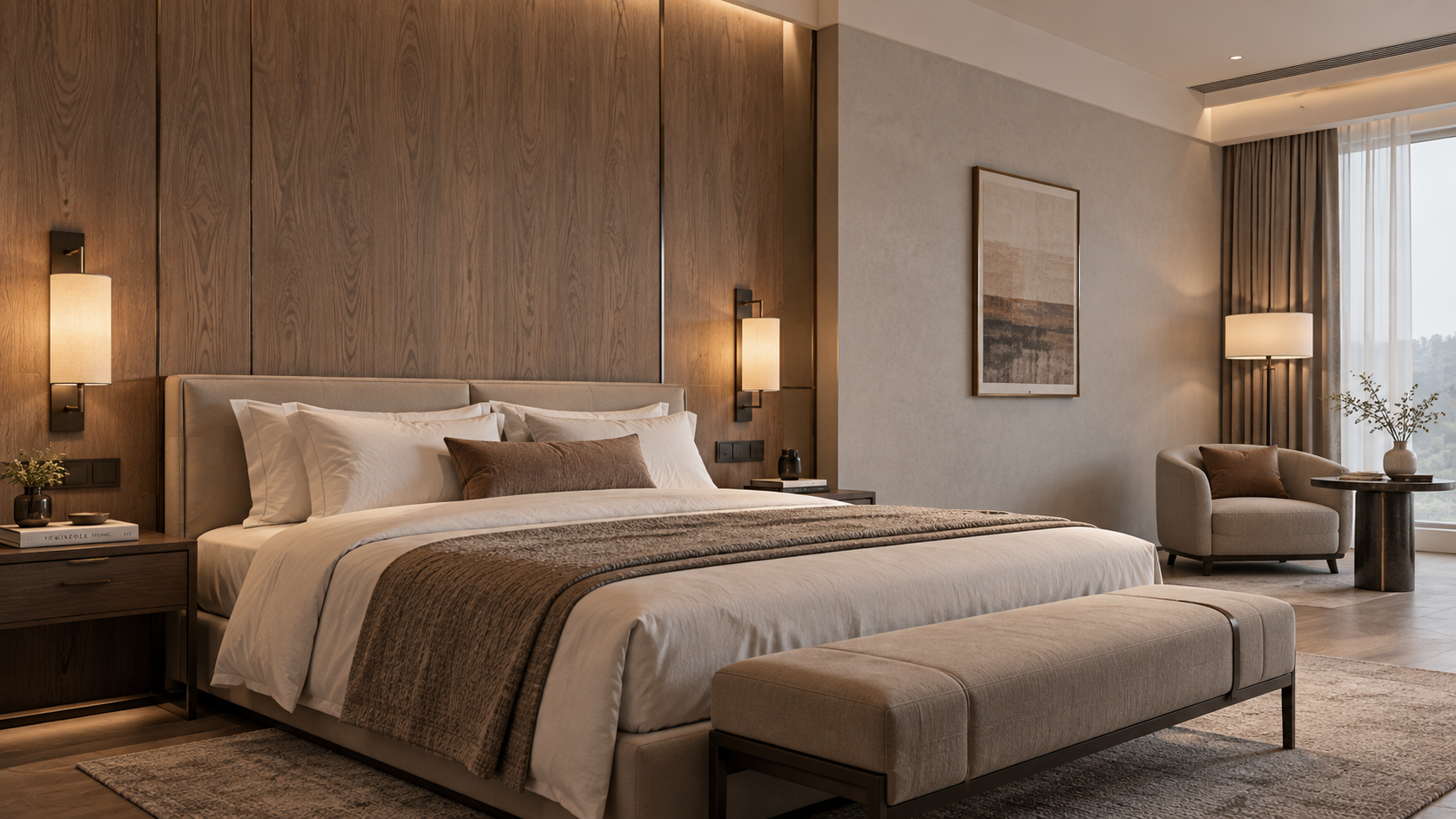
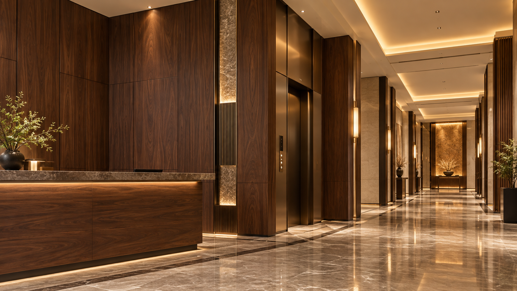
A panel does not exist in isolation. Surrounding materials, room scale, lighting direction, and viewing distance all influence whether a wood grain surface feels authentic. In a small residential cabinet door, minor repeat patterns may go unnoticed. On a hotel corridor wall, those same repeats may become visually distracting.
Likewise, pairing a wood-look panel with stone, metal, or terrazzo-inspired finishes can either strengthen or weaken the effect depending on balance. In some commercial interiors, designers intentionally combine warm wood visuals with harder mineral surfaces to create contrast. In those projects, alternatives such as Cementterrazzo-MLSW030 may enter the discussion not because they imitate wood, but because realism is only one of several design goals alongside fire behavior, maintenance, and visual differentiation.
What researchers should look for when comparing Wood Grain Decorative Panels
For an early-stage evaluation, the most useful approach is practical rather than theoretical. Instead of asking whether a panel “looks like wood” in general, assess whether it remains convincing across the conditions in which it will actually be used.
A reliable comparison usually includes:
- viewing the panel under multiple lighting conditions;
- checking texture-to-print alignment by touch and sight;
- reviewing large-format samples, not only small swatches;
- inspecting edge treatment and machining quality;
- asking about batch consistency and replenishment capability;
- matching the substrate to the environmental and performance requirements.
The most important insight is that realism is cumulative. It comes from many small decisions made correctly, not one dramatic feature. A panel with excellent print but poor embossing will disappoint. A good texture with unstable color will still look artificial. A strong sample installed with weak joint planning will lose its effect on site.
For market observers and sourcing teams, that is also why the segment continues to evolve. As digital printing, embossing control, coating chemistry, and substrate engineering improve, the gap between decorative imitation and natural material experience narrows. But the market remains uneven. Some products are designed mainly to pass quick visual inspection; others are engineered to hold up under closer scrutiny, repeated use, and project-scale application.
In the end, the realism of Wood Grain Decorative Panels is best understood as a systems issue. Surface graphics matter, but they are only the beginning. Texture, gloss, substrate stability, edge detailing, durability, and installation logic determine whether the finished panel merely references wood or truly delivers a credible wood-like material experience.
RECOMMEND

Sep 23, 2026
What are engineered panel systems?
Learn how engineered panel systems integrate framing, insulation and sheathing for efficient construction. Compare SIPs, metal building panels and engineered wood panels, including structural performance, thermal efficiency, code compliance and selection factors.

Sep 22, 2026
Are Composite Panels Worth Choosing Over Gypsum Walls for Boutique Hotels?
Is it worth switching to composite panel solutions over traditional gypsum wall systems for boutique hotels? Compare design impact, renovation speed, moisture, fire, acoustics, and lifecycle value.
Sep 20, 2026
What Are the Risks of Standard Panels in Premium Commercial Interiors?
What are the key risks of using standard decorative panels in premium commercial interior projects? Explore fire, wear, moisture, and compliance risks.
Sep 11, 2026
How to Manage the Logistics of a Custom Decorative Panel Manufacturing Project with Multiple Suppliers?
Learn how to manage Custom Decorative Panel Manufacturing with multiple suppliers. Discover strategies for supply chain coordination, quality control, and logistics to ensure project success. Streamline your process with expert tips.