


How to Select the Right Color Palette for Commercial Interior Panel Solutions in a Tech Startup Office?
Color Isn't Just Decoration; It's a Strategic Asset
Walk into a typical tech startup and you’ll often see the same thing: exposed ceilings, white walls, and a few neon signs. It’s a look that works, but it often feels more like a rented storage unit than a place where creativity and innovation are supposed to happen. For decision-makers, the challenge isn't just about picking a color that looks good on a paint chip. It's about selecting a Commercial Interior Panel Solutions palette that actively works for your business—supporting your brand, influencing your team's psychology, and holding up under the wear and tear of a fast-paced environment.
Let’s be honest: the wrong color can drain energy. A sterile, all-white office might feel “clean,” but it can also feel cold and uninviting. A dark, moody room might seem “cool,” but it can kill productivity. The goal is to find a balance that is both functional and inspiring. With the right approach, your office panels become a silent partner in your company’s success.
Step 1: Define Your Brand’s Emotional DNA
Before you even look at a material sample, you need to answer a fundamental question: What does your startup want to feel like? This isn't about your logo colors. It’s about the emotional experience you want to create for employees and visitors.
Think about the adjectives that describe your company culture. Are you disruptive and bold? Then consider a palette that uses high-contrast, saturated colors like deep blues paired with vibrant oranges or yellows. Are you focused on wellness and sustainability? Earthy greens, warm beiges, and muted natural tones might be a better fit. A fintech startup focused on security might lean towards deep, stable blues and crisp whites, while a creative agency might thrive with dynamic, playful accents.
Your Commercial Interior Panel Solutions are the largest surface area in your office. They are the canvas for your brand story. A mismatch here sends a confusing message to both your team and your clients. You want someone to walk into your space and immediately “get” what your company is about, without reading a single word on a wall.
Step 2: Understand the Psychology of Color in the Workplace
This goes beyond “blue is calming.” Different colors trigger different cognitive and emotional responses, and you want to use this to your advantage. Here’s a quick breakdown of how specific hues can affect your startup environment:
- Blue: The productivity color. It promotes focus, clarity, and communication. It’s excellent for open-plan work areas, meeting rooms, and spaces where deep thinking is required. However, too much cool blue can feel cold, so balance it with warmer accents.
- Green: The restorative color. It reduces eye strain and promotes a sense of balance and calm. This is ideal for break rooms, quiet zones, or areas near windows where you want to bring the outside in. It’s also a strong signal for a company that values sustainability.
- Yellow: The creativity color. It stimulates energy, optimism, and innovation. Use it as an accent in brainstorming rooms, common areas, or collaborative zones. Avoid using it in large, flat areas, as it can become overwhelming and cause eye fatigue.
- Neutral Tones (Grays, Beiges, Whites): The foundation of modern design. They provide a clean, professional backdrop. But they are not a one-size-fits-all solution. The key is to choose neutrals with a subtle undertone (warm or cool) that complements your brand. A flat, pure white can feel sterile, while a warm off-white can feel more inviting.
Your chosen palette shouldn’t be a single color. It should be a system. A strong strategy is to use a 60-30-10 rule: 60% of the space (walls, large panels) in a neutral base, 30% in a secondary color (furniture, accent walls), and 10% in a bold accent color (feature panels, art, signage). This creates a visually balanced, professional, and dynamic environment.
Step 3: Consider the Practical Realities of a Tech Startup
Tech startups are dynamic. They are not static law firms or quiet libraries. Your space needs to be flexible, durable, and adaptable. This is where the material of your Commercial Interior Panel Solutions becomes as important as the color itself.
Think about the everyday life of your office. People are moving, collaborating, eating at their desks, and maybe even having a spontaneous ping-pong match. The surfaces need to be forgiving. A high-quality, durable panel material like a cement terrazzo or a rich, textured laminate can withstand the hustle and bustle without showing every scuff mark or coffee stain. It’s about choosing a color that can hide daily wear and tear while still looking sophisticated.
Another critical factor is light. The color you see on a small sample in a factory showroom will look completely different under the fluorescent lights of your office or the natural light from a floor-to-ceiling window. Always test samples in the actual space at different times of the day. A color that looks vibrant in the morning can look flat and dull in the afternoon. This is a common mistake that can cost thousands to fix later.
Step 4: Create a Visual Journey, Not a Single Color
Your office is not a single room. It’s a series of zones with different functions. Your color palette should guide people through these zones. The entrance area should be warm and welcoming, perhaps using a neutral base with a pop of your brand color. The main work area should be focused and calm, with cool blues or soft greens. The break room should be energizing, with warm yellows or playful accents. A quiet focus room should be restful, with muted, earthy tones.
Using Commercial Interior Panel Solutions allows you to create these distinct zones effectively. You can use a change in panel color to signal a transition from a collaborative space to a quiet zone, without needing to build walls. This is a brilliant way to define the flow of your office without expensive construction. The panels themselves become the wayfinding system.
Making the Final Decision
When you’re down to the final two or three options, think about the long-term. A trendy color might look great today, but will it feel dated in two years? A classic, timeless palette with a few strategic, updatable accent colors is a safer bet for a startup that might be in this space for the next 5-10 years. You can always change the accent colors with paint or new furniture, but changing the main wall panels is a major renovation.
Finally, ask your team. A quick survey or a few sample boards in the break room can provide invaluable feedback. They are the ones who will live in this space every day. Their input can prevent a costly mistake and ensure that the new palette actually improves their daily experience. A workspace that feels like their own is a workspace that inspires them to do their best work.
For a modern, durable, and visually striking option, consider materials that offer both texture and resilience. A product like Cementterrazzo-SW005 provides a sophisticated, industrial-chic texture that can anchor a space beautifully. Its neutral yet warm tone works as an excellent base for a variety of accent colors, giving you the flexibility to evolve your brand’s expression over time.
Choosing the right color palette is an investment in your company’s culture and productivity. It’s a decision that should be made with both your head and your heart. By understanding your brand, the psychology of color, and the practicalities of your space, you can create an office that is not just a place to work, but a place to thrive.
RECOMMEND

Oct 26, 2026
How Do You Choose Fire-Resistant Composite Panels for Commercial Use?
Choose fire resistant composite panels for commercial interior projects. Learn how to verify fire documentation, compare options, and avoid costly specification mistakes.
Oct 26, 2026
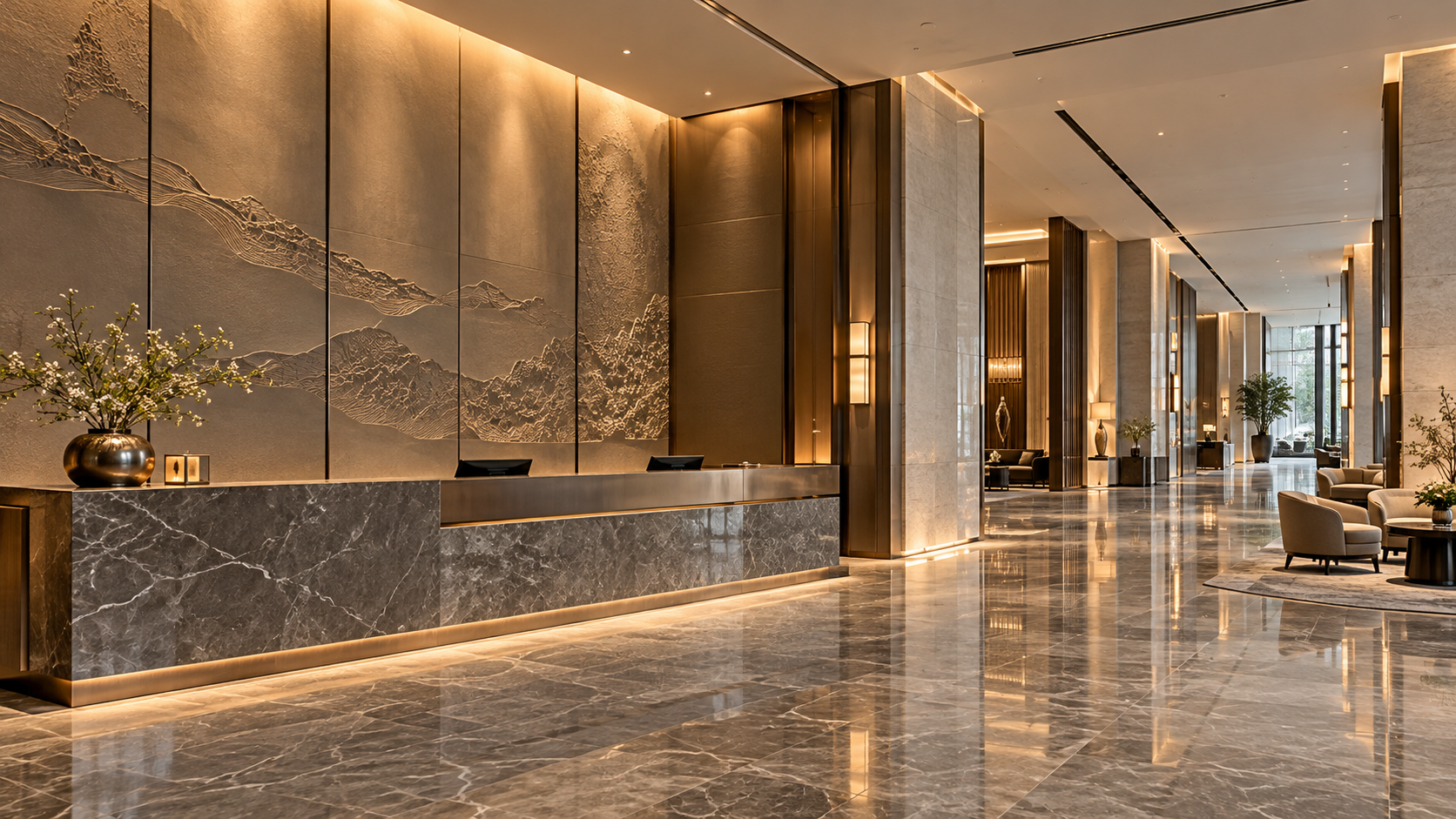
Are Meilin Board Custom Panels Suitable for Luxury Hotel Lobbies?
Explore Meilin Board custom decorative panels for luxury hotel lobbies. Discover design considerations and essential fire, emissions, and maintenance checks before specifying your project.
Oct 26, 2026
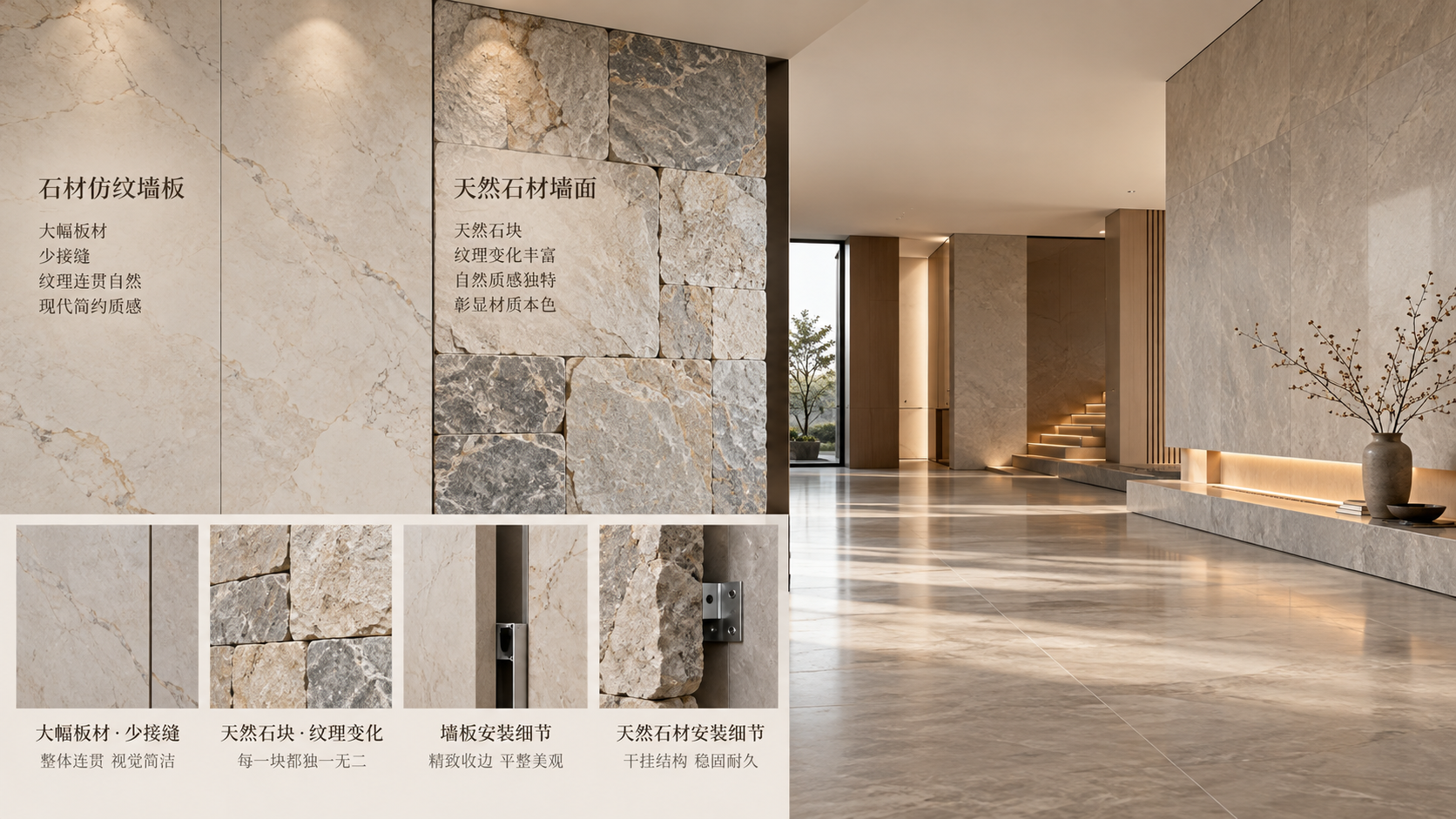
Stone-Look Wall Panels vs. Natural Stone: Which Costs Less?
Compare stone look wall panels vs natural stone cost, from materials and installation to maintenance. Discover which option delivers better value for your next wall project.
Oct 25, 2026
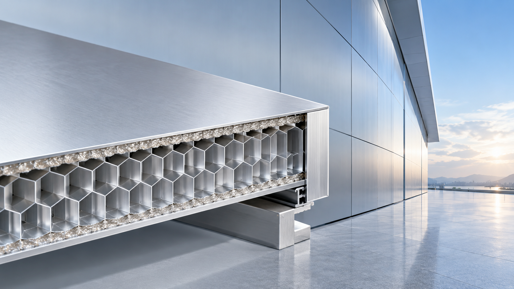
How Strong Are Meilin Board Aluminum Honeycomb Panels?
Explore aluminum honeycomb panels structural strength with Meilin Board. Learn how thickness, core design, and fixings affect performance to choose panels confidently.