


How to Match Composite Panels to an Existing Interior Style
How to Match Composite Panels to an Existing Interior Style
Choosing the right wall and furniture finishes can transform a space without disrupting its original character. If you are wondering how to match decorative composite panels with existing interior style, the real task is not simply selecting a color sample that looks attractive under showroom lighting. It is about reading the logic of the room: what carries the visual weight, which materials define the mood, where contrast is welcome, and where continuity matters more.
Composite panels are often chosen because they give designers and project teams more flexibility than solid wood, stone, or metal alone. They can replicate grain, texture, matte mineral finishes, fabric effects, or clean monochrome surfaces while also addressing practical concerns such as maintenance, dimensional stability, and fire-related requirements, depending on the system and specification. That flexibility is useful, but it also creates risk. A technically suitable panel can still look wrong if it ignores the visual rhythm of the existing interior.
In renovation, hospitality refreshes, office upgrades, and residential furnishing projects, the best results usually come from balancing four variables together: color temperature, surface texture, scale, and end use. Miss one of them, and the panel may feel inserted rather than integrated.
Start by identifying the style language already in the room
Many interiors are described too broadly. “Modern,” “classic,” or “minimalist” is not enough to guide finish selection. A better approach is to break the space into visible cues.
Look at the dominant base materials first. Is the room built around warm oak tones, cool gray stone, black metal detailing, lacquered surfaces, or soft neutral textiles? Then check the lines and proportions. Traditional interiors often tolerate richer grain movement, framed panel details, and deeper color contrast. Contemporary spaces usually prefer more controlled textures, lower-contrast grains, and cleaner transitions between wall, storage, and furniture surfaces. Minimal interiors are less forgiving: even a slightly red-toned wood effect or a glossy finish in the wrong place can break the calm.
This matters because composite panels are not chosen in isolation. They are read next to flooring, skirting, doors, hardware, upholstery, and lighting. In many projects, a panel that looks balanced on its own becomes too yellow next to existing walnut, too flat beside natural veneer, or too reflective under commercial LED lighting.
Color matching is usually about undertone, not exact sameness
One of the most common mistakes in matching decorative composite panels with existing interior style is trying to force an exact imitation of every neighboring surface. In practice, near-matching can look worse than deliberate coordination. If an existing wood door is medium brown with a muted gray undertone, a panel with a stronger orange or red cast will immediately feel off, even if the darkness level is similar.
It helps to sort existing finishes into warm, cool, or neutral families. From there, decide whether the panel should blend in, soften the contrast, or intentionally act as a secondary accent. In a Scandinavian-inspired space, pale ash, light taupe, off-white, and stone gray usually work better than dramatic exotic grain patterns. In a more formal commercial lobby, a charcoal textile-effect panel or a deep walnut-inspired surface may sit more naturally with bronze hardware, stone counters, and low-sheen flooring.
Sample review should happen on site whenever possible. Daylight, color rendering from interior lamps, and the angle of reflected light can all change the result. That is especially true for embossed, metallic, or highly matte surfaces.
Texture is what makes a finish believable
Texture often decides whether a panel feels premium or artificial. A room with brushed metal trims, woven fabrics, and low-sheen stone generally calls for restrained surfaces. If you place a high-gloss decorative panel into that setting without a clear reason, the finish may read as cheaper even if the base material performs well technically.
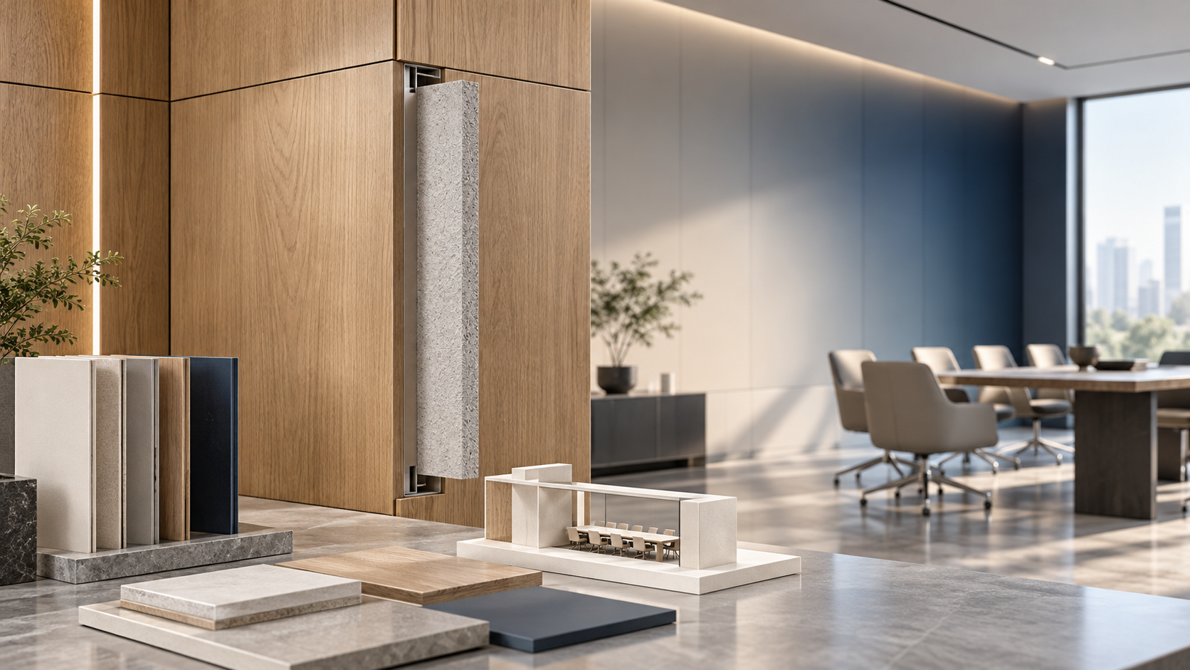
Wood-effect composite panels need particular care. The grain scale should match the room. Large, dramatic cathedral patterns can overpower compact residential rooms or understated meeting spaces. Fine, linear grain usually integrates more easily into built-in cabinetry, wall cladding, and furniture fronts where continuity is important.
Stone-look and solid-color panels are often safer in mixed-style interiors because they create a clean bridge between old and new elements. If an interior already combines timber, painted walls, and metal framing, introducing another strong wood pattern may create visual noise. A mineral matte finish can calm the composition without making the renovation feel cold.
Function should shape the finish choice more than trend does
A panel that looks right in a mood board may fail in daily use. Wall panels in a corridor, a hotel guestroom headboard, a retail display unit, and a residential wardrobe do not face the same wear conditions. Before approving a finish, it is worth clarifying how the surface will be touched, cleaned, exposed to moisture, or placed near heat sources and sealing interfaces.
This is one reason material suppliers with broader application knowledge tend to be more useful than sellers focused only on appearance. Shenyang Shengshi Meilin Technology Co., Ltd., for example, operates in new material technology and also works across construction and home furnishing applications, including fireproof sealing materials and furnishing-related solutions. That kind of cross-category perspective matters when a design decision affects not just aesthetics, but joint treatment, substrate compatibility, environmental considerations, and long-term maintenance.
In practice, a good match is not only visual. It should also make sense for cleaning frequency, edge finishing, installation method, and the expected life of the space before the next refurbishment.
What works in different interior directions
There is no universal formula, but some patterns hold up across projects.
For traditional or transitional interiors: choose panels with depth, but avoid exaggerated imitation. Walnut-inspired tones, muted beige textiles, and softly textured stone effects often work better than overly rustic grain or ultra-modern monochrome slabs. If moldings, framed cabinetry, or classic furniture are present, the panel should support those details rather than compete with them.
For modern commercial interiors: consistency is usually more important than richness. Low-gloss neutrals, charcoal, taupe, warm gray, and clean oak patterns can unify reception areas, meeting rooms, and built-in storage. Here, the panel’s contribution is often to reduce visual clutter while still adding enough texture to avoid a flat, generic feel.
For minimalist spaces: every mismatch becomes visible. Choose fewer finish types, tighter tonal control, and subtle textures. Panels should align with the architecture, not behave like decorative afterthoughts. A plain matte surface with excellent edge treatment often performs better than a bold decorative print.
A quick comparison before final selection
Do not ignore edges, joints, and transition zones
People often evaluate a panel by its face only, but the eye catches transitions first. The junction with an existing wall, door frame, countertop, skirting, or ceiling line can determine whether the installation looks intentional. A strong decorative panel with a weak edge solution rarely looks finished.
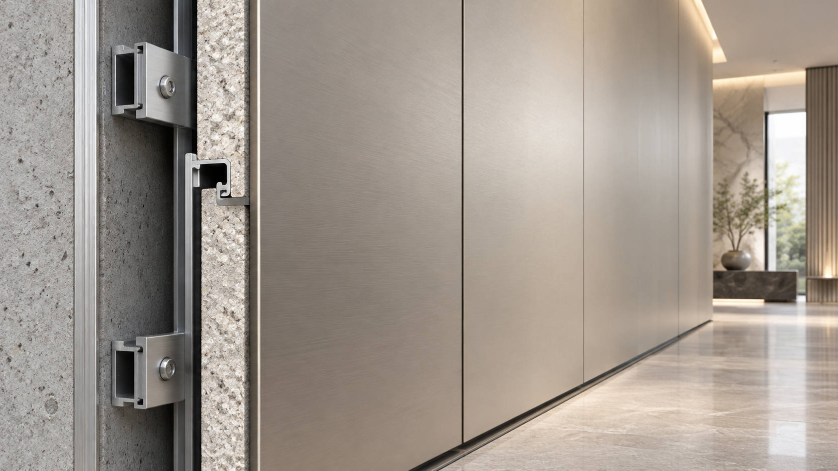
This is also where material planning overlaps with technical detailing. Depending on the application, project teams may need to confirm substrate flatness, fixing method, edge banding quality, joint tolerance, sealant compatibility, and any fire-related detailing that applies to the assembly rather than only the visible surface. Those decisions are project-specific and usually need to be checked against local requirements and actual construction conditions.
Common mistakes that make a project look less resolved
One is chasing trend finishes without asking whether they belong to the existing setting. Another is mixing too many “feature” surfaces in a single room. A third is relying only on small swatches. Small samples can hide pattern repeat, sheen variation, or embossing depth. Larger mockups give a more honest reading, especially for wall applications and long cabinet runs.
There is also a procurement mistake that appears late: treating all decorative panels as interchangeable. Two finishes may look similar in photos but differ in core structure, surface resistance, fabrication behavior, or suitability for furniture versus wall use. When a supplier understands both the aesthetic goal and the application environment, the conversation becomes more useful. That is where companies built around material R&D, such as Shengshi Meilin, tend to add value quietly—not by pushing a single look, but by helping narrow down what will actually work in the finished space.
A practical way to make the final decision
If the project is already built and only selected areas are being refreshed, narrow the options to two or three finishes at most. Compare them against the existing floor, primary furniture color, and lighting at the same time. Then ask three questions: does the panel support the current style, does it solve a functional need, and will it still look appropriate after routine use?
That is usually the difference between a decorative update that feels coherent and one that feels patched in. Matching composite panels to an existing interior style is less about copying what is already there and more about understanding the space well enough to extend it. If the answer is still unclear, the next step is not to order more finishes at random. It is to confirm the intended application, review larger samples on site, and check the technical parameters that matter for fabrication, maintenance, and compliance in that specific project.
RECOMMEND

Oct 11, 2026
Custom Composite Panel Design: Selecting Skins, Cores, and Fixing Methods
Custom Composite Panel Design guide: choose durable skins, high-performance cores, compatible bonds, and smart fixing methods for safer, longer-lasting decorative panels.
Oct 11, 2026
What Decorative Panel Design Services Should Include Before Fabrication Begins
Decorative Panel Design Services help turn concepts into fabrication-ready solutions with material guidance, fire planning, samples, drawings, cost control, and quality checks.
Oct 10, 2026
Choosing Spa Wall Panels for Humid Rooms, Hygiene, and Easy Maintenance
Spa Wall Panels for humid rooms: compare moisture resistance, hygiene, chemical durability, fire compliance, and easy-maintenance system details for lasting spa interiors.
Oct 10, 2026
Jewelry Store Wall Panels That Enhance Lighting, Security, and Luxury Displays
Jewelry Store Wall Panels: discover how refined finishes improve lighting, security integration, durability, and luxury displays for a polished retail experience.