



How Do You Match Colors for Wood Grain Panels?
Matching colors for wood grain panels starts with understanding undertones, lighting, and the overall mood you want to create. Whether you are coordinating wall panels with furniture, flooring, or other decorative materials, the right palette can make a space feel balanced and welcoming. This guide to wood grain panel color matching explores how to combine warm and cool tones, select complementary finishes, and test samples in your space for a cohesive result.
For commercial interiors, the challenge is rarely finding one attractive finish. It is making that finish work across a full wall, beside other specified materials, under the lighting that will actually be installed. A panel that looks restrained on a desk can feel much redder, yellower, or more patterned when it covers a reception area. Treat the selection as a relationship between materials, not as a search for a single perfect color.
Start with the colors that cannot easily change
Before comparing wood grain samples, identify the fixed elements in the space. Flooring, stone, window frames, large furniture pieces, and existing cabinetry often have a stronger influence on the palette than a paint swatch. If the floor is already installed, for example, its undertone and visual texture should guide the wall finish rather than compete with it.
Separate these elements into three practical groups: materials that must stay, materials that can still be selected, and small accents that can change later. This prevents a panel choice from being driven by a minor accessory while overlooking a large expanse of tile or a fixed joinery finish.
A useful early decision is whether the wood grain will be the dominant surface or a supporting detail. A full-height feature wall can carry more visual weight than panels used only on a counter front. If the panel has a bold pattern, quieter flooring and upholstery will usually make the room easier to resolve. If the surrounding materials are already busy, a more even grain may be the better choice.
Read the undertone, not just the name
Descriptions such as oak, walnut, ash, or teak suggest a family of appearances, but they do not guarantee a particular color. One oak-look panel may have a golden base; another may lean gray or pink. Even two samples described as natural can look noticeably different when placed together.
Look beyond whether a panel is light or dark. Ask whether its background reads yellow, orange, red, pink, gray, or greenish. Warm wood tones often sit comfortably with cream, beige, terracotta, and other warm finishes. Cooler or gray-toned grains can work well with blue-gray, charcoal, and cooler whites. These are starting points, not rules: a warm panel beside a cool surface can be effective when the contrast is deliberate.
White is particularly easy to underestimate. A crisp, cool white next to a yellow wood grain can make the panel appear more golden. A creamy white may soften that contrast but could look too yellow beside a pink-toned panel. Compare the actual paint and panel samples edge to edge, then step back and judge them in the room. Naming a color correctly matters less than seeing how the two surfaces affect each other.
If the panel contains several grain colors, use the quieter background tone to guide large neighboring surfaces. A dark streak may be useful as a reference for a frame or metal detail, but matching every element to the darkest line can make the overall scheme heavier than intended.
Coordinate flooring, furniture, and other finishes
Wood-look flooring and wall panels do not need to be identical. In fact, a near match can be harder to manage than a clear contrast: two similar finishes with slightly different undertones may look mismatched rather than coordinated. A lighter wall against a deeper floor, or a restrained wall grain beside a more expressive floor, gives each surface a distinct role.
When a continuous wood effect is the design goal, request samples from the actual materials being considered for both surfaces. Check them side by side and at the angles at which they will be seen. A floor reflects light differently from a vertical wall, so even matching finishes may not look identical after installation.
Mixing different wood tones
A room can comfortably contain more than one wood tone. The key is to establish a relationship between them. A pale panel with warm undertones can sit well with darker brown furniture if both share a similar warmth. Alternatively, a cool gray-brown panel can create a deliberate counterpoint to warm timber furniture when neutral upholstery or flooring helps connect the two.
Pay attention to grain scale as well as color. A panel with large knots and strong cathedral patterns can compete with heavily figured furniture, even when the colors are compatible. Where furniture has an expressive grain, a quieter straight-grain or lightly figured panel may be easier to use across a large surface.
Stone, metal, and fabric need consideration too
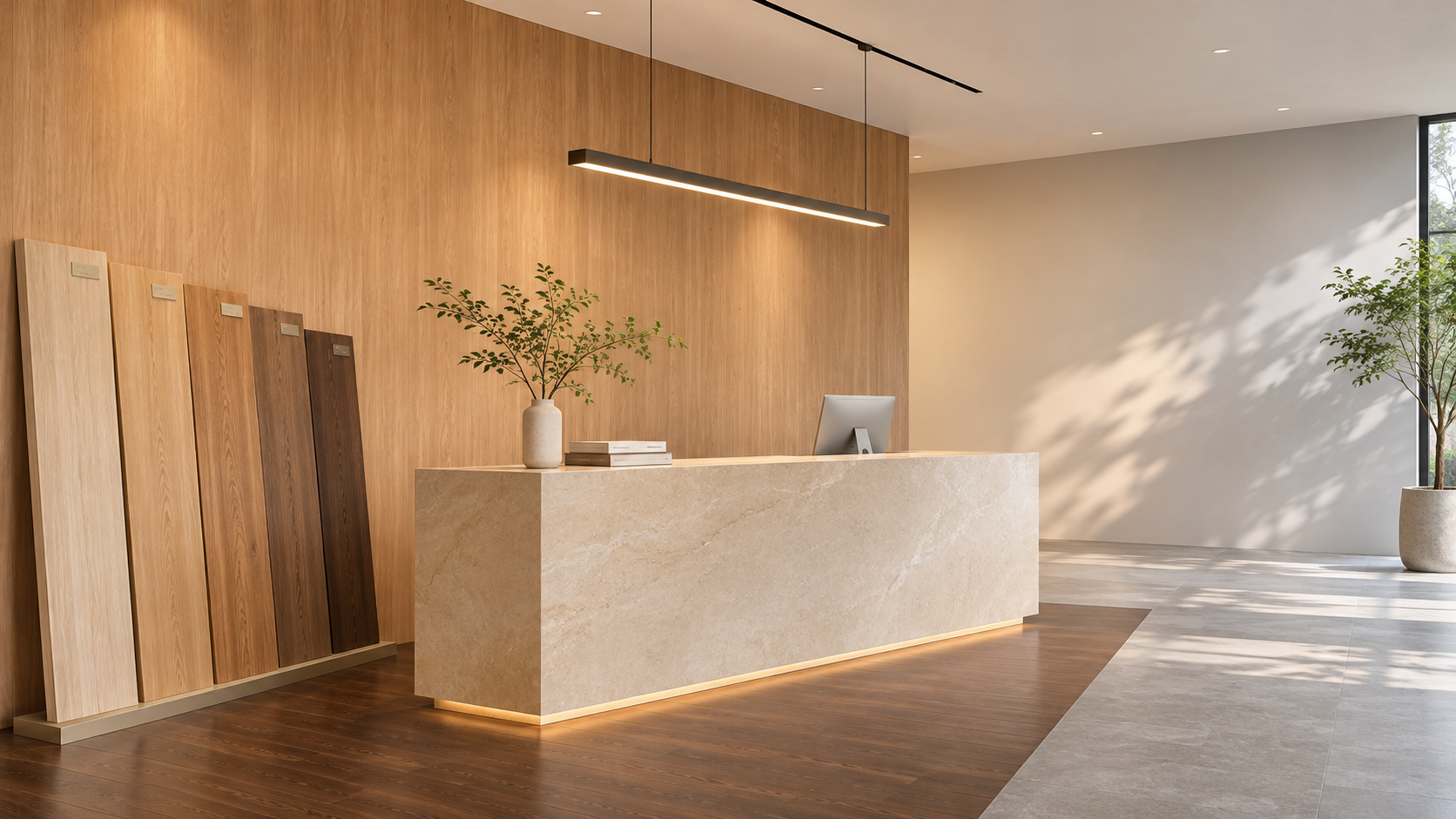
Stone and stone-look surfaces often contain subtle undertones that only become obvious beside wood. A gray surface may lean blue, green, or brown; a cream surface may contain pink or yellow. Compare samples in the proportions intended for the space whenever possible, especially if both materials will be prominent at a reception desk or feature wall.
Metal finishes can reinforce the palette without matching the wood. Warm brass tones may support a golden or reddish scheme, while black or cool metal can introduce definition. Fabric and upholstery offer another way to bridge materials: a neutral textile that relates to both the panel and the floor can soften a contrast that otherwise feels abrupt.
Lighting can change the decision
The same panel can look different in a daylight-filled showroom, under office lighting, and in a warmly lit hospitality space. Light affects not only perceived color but also the visibility of grain and surface texture. Glossy finishes may produce bright reflections, while matte or textured surfaces can look deeper or less uniform as the viewing angle changes.
Review samples under the project’s intended lighting whenever feasible. If final fixtures are not yet installed, use representative light sources and record that the decision remains provisional. Check the panel during the day and after dark if both conditions matter to the space. A finish chosen only under temporary construction lighting may need to be reconsidered once the permanent scheme is in place.
Position also matters. Place a wall panel sample vertically rather than flat on a table, and compare it with flooring laid horizontally. Look from the main approach and from the side, especially where grazing light will run along a wall. Surface sheen and texture may draw more attention than the color difference that was visible in a catalog.
Test the finish at a useful scale
A small swatch is useful for narrowing options, but it cannot show the full character of a repeated grain pattern. Before approving a major installation, ask for a larger sample or mock-up appropriate to the project. Review the background color, grain contrast, texture, sheen, and the way individual panels meet.
For printed or decorative wood grain surfaces, ask how the pattern repeats and whether adjacent panels can be arranged to avoid obvious repetition. For natural wood surfaces, discuss expected variation between pieces and how the supplier proposes to select or sequence them. A sample represents an appearance; it should not automatically be treated as a promise that every panel will be identical.
The edges deserve attention too. Visible corners, cut edges, trim profiles, and edge banding can interrupt an otherwise convincing finish if their color or sheen differs from the panel face. Include these details in the mock-up when they will be exposed, and agree on how grain direction will run around returns and openings.
Agree on what “matching” means before ordering
In project discussions, matching can mean an exact visual match, a coordinated family of colors, or simply a finish that does not clash. Those are different expectations. Define which one applies and identify the material that acts as the reference: an existing floor, an approved panel sample, a furniture finish, or a design board.
Keep an approved physical sample where practical, and document the product or finish identification, surface texture, sheen, grain direction, and intended application. Photographs are useful for communication but should not be the sole approval reference; screens, cameras, and lighting can all alter color appearance. If a project will be supplied in phases, discuss batch consistency, retained reference samples, lead times, and the procedure for reviewing later deliveries.
Where color measurement is used, agree in advance on the measurement method, reference surface, viewing conditions, and any acceptable tolerance. A numerical color comparison can support a decision, but it does not replace a visual review of grain, gloss, and texture. Two surfaces can be close in measured color and still appear different in a room.
Do not let color override the material specification
A finish that looks right still needs to suit its location. A decorative wall in a low-contact meeting room faces different demands from a corridor, a reception counter, or an area exposed to frequent cleaning. Ask for the relevant product information on surface durability, cleaning methods, moisture exposure, substrate, installation, and maintenance before the design is locked in.
Fire performance and environmental requirements also depend on the complete product, its intended use, and applicable local requirements. A wood grain appearance alone says nothing about those properties. Review the supplier’s documentation for the specific panel and assembly, and confirm whether the proposed installation meets the project requirements.
This broader materials view is relevant to companies such as Shenyang Shengshi Meilin Technology Co., Ltd., whose work spans new material applications, fireproof sealing materials, and furniture and home furnishings. For a project team, the practical question is how the chosen decorative surface will relate to adjoining materials and installation details—not simply whether it matches a color chip.
Before final approval, bring the panel, floor, paint, trim, and key furniture finishes together under representative light. Resolve the visible junctions, record the approved reference, and confirm the performance and delivery requirements for the actual application. That gives the design team and supplier a shared basis for judging both the color and the finished installation.
RECOMMEND

Nov 18, 2026
Can Decorative Wall Panels Handle Spa Humidity?
Can decorative wall panels handle the humidity in a spa? Discover how to choose the right materials and wall systems for lounges, showers and steam rooms.
Nov 18, 2026
How Do You Match Colors for Wood Grain Panels?
Master wood grain panel color matching with practical tips on undertones, lighting, flooring, and finishes. Create a cohesive space with confidence.
Nov 17, 2026
How Do You Read an E0 Decorative Board Test Report?
Learn how to read an E0 decorative board test report, verify emission limits and sample details, and choose the right board with confidence.
Nov 17, 2026
How Do You Choose Lightweight Wall Panels for Hotels?
Choose lightweight panels for hotel walls with confidence. Compare fire safety, durability, installation and cost to find the right finish for every space.