



How Can You Check a Panel Sample Against the Production Finish?
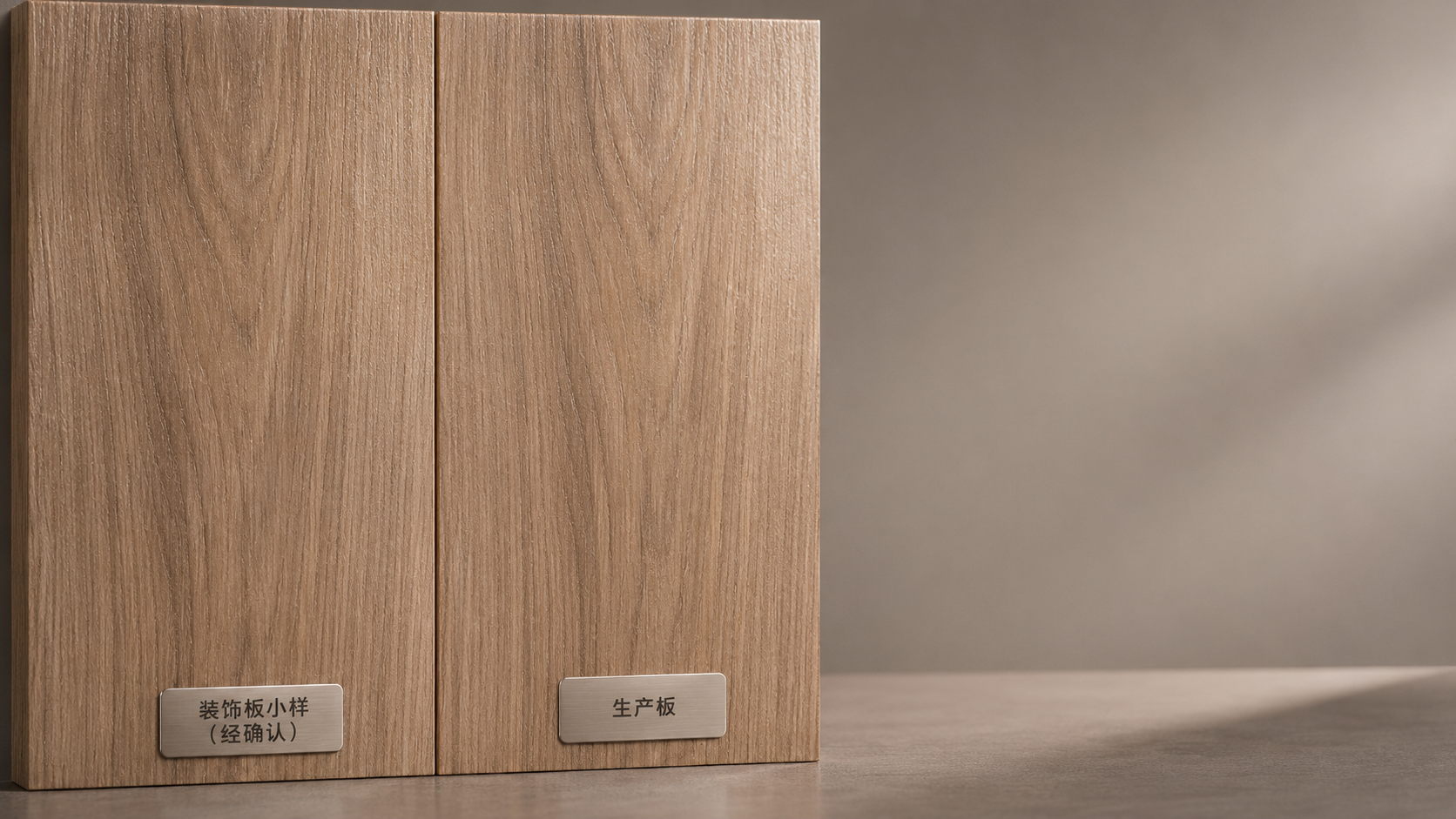
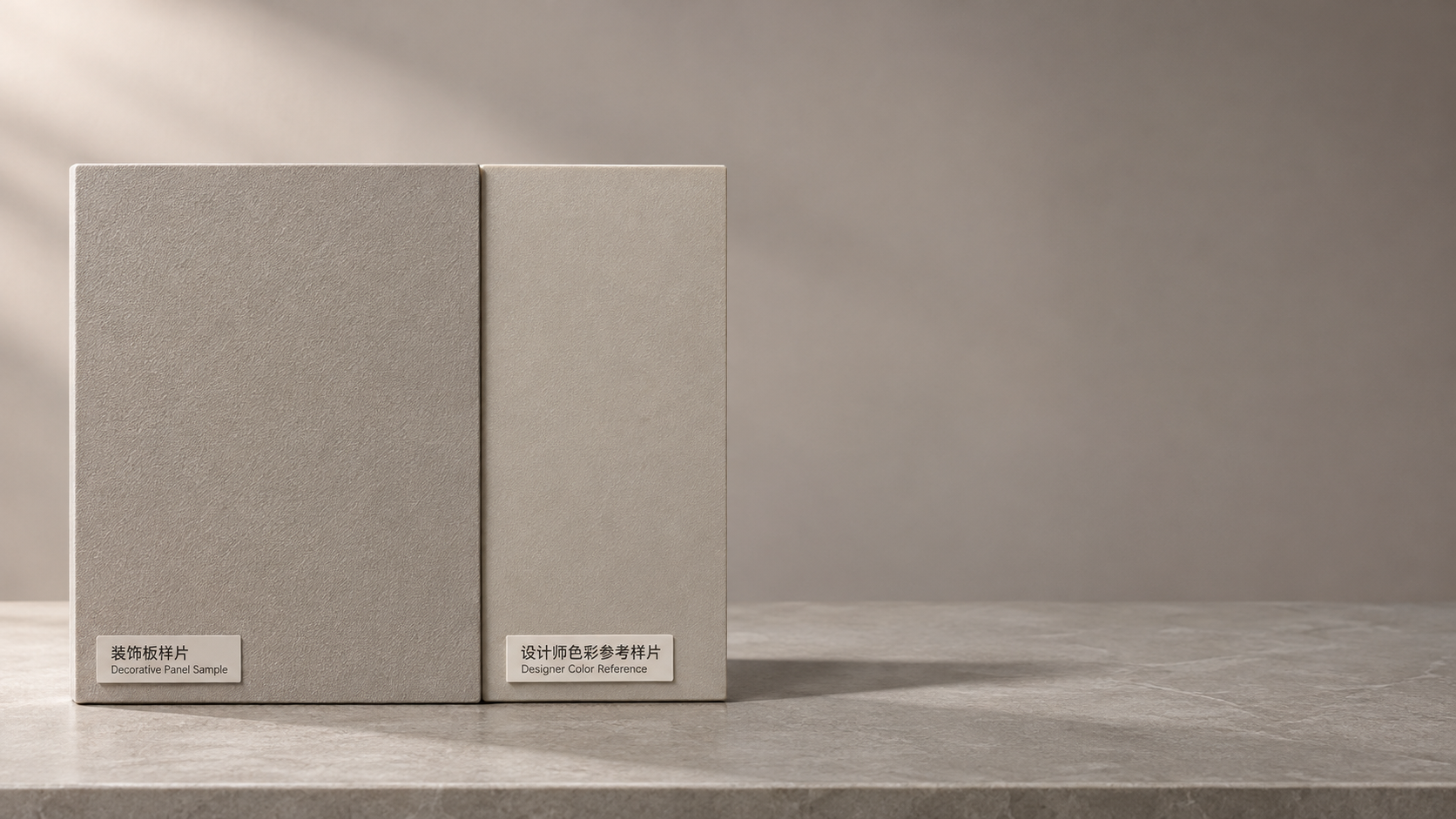
To check whether a panel sample matches the final production finish, place the approved sample beside representative production panels and compare them under the same lighting, at the same angle and in the intended installation orientation. Check color, sheen, texture and pattern, then judge any differences against an agreed range of acceptable variation. Record the result before the panels are cut or installed.
A small sample can look convincing on its own, yet a wall of panels may reveal a different sheen, a repeating pattern or variation between batches. The aim is not always to establish that every surface is identical. It is to determine whether the production finish falls within the appearance range accepted for the project, and whether any difference will remain noticeable under normal viewing conditions.
Start with the right reference materials
The most useful reference is the actual sample approved for the order, not a photograph, a screen image or an earlier option that looked similar. Confirm that it carries the correct finish name or code, surface treatment, substrate and version where applicable. Keep any written approval or finish specification with it. A color name alone may not distinguish between a matte and textured version of the same design.
Check the condition of the reference before using it. Dust, fingerprints, protective film, fading or cleaning residue can change its apparent color or gloss. Remove loose dust using the supplier’s recommended method, but do not polish or apply a cleaning product merely to make the sample look closer to the production panel. If the sample has visibly aged or its identity is uncertain, establish a replacement reference with the supplier before making a final judgment.
Obtain a production panel from the actual order whenever possible. A pre-production or showroom sample can help explain the intended appearance, but it does not establish what the delivered batch looks like. Compare more than one panel when the order includes multiple batches, production runs or visibly different packages. Note the batch identification and panel location so that a difference can be traced rather than treated as a general impression.
Set up a comparison that reflects the finished space
Place the sample directly against the face of a production panel, with the surfaces in the same plane and the grain or pattern running in the same direction. Leave no large gap between them: visual memory is unreliable when the pieces are viewed separately. Use a neutral background where practical, and make sure neither surface casts a shadow on the other.
First compare the pieces in diffuse, reasonably even light. Then inspect them under the lighting planned for the space, or as close to it as available. Daylight, warm interior lighting and cooler artificial light can make the same two finishes appear more or less alike. A match under one light source is not necessarily a match under another; this effect is often called metamerism.
View the surfaces from the normal position of someone using the room, then move to a shallow angle. The face-on view is useful for overall color and pattern. An oblique view makes sheen differences, surface texture and some coating defects easier to see. If the panels will be installed vertically, hold or position them vertically for the final visual comparison; a horizontal sample can reflect light quite differently.
Keep the conditions consistent when comparing several panels. Moving one panel into sunlight while leaving another in shadow makes the result difficult to interpret. Equally, an unusually harsh inspection light may reveal marks that are not apparent in normal use. Both views can be useful, but record which condition exposed the difference rather than treating every observation as equally significant.
Compare the finish in layers
Color and undertone
Look first for the overall color, then for undertones: a neutral gray may lean warmer, greener or bluer than the reference. Compare the surfaces side by side for long enough to see the difference, but also step back to assess the effect at a normal viewing distance. A small color shift that is obvious at the seam may be less important in a separated installation; the reverse may be true for adjoining panels across a large wall.
Pay attention to changes under the actual light sources in the room. If two pieces match in daylight but separate noticeably under the specified lamps, document both observations. The relevant decision is whether the difference is acceptable in the space where the finish will be used, not whether it disappears under the most favorable light.
Sheen and reflection
Two panels can have similar color but different gloss levels. Hold them so the same light source reflects across both surfaces. Compare the brightness and width of the reflection, as well as any change from one area to another. A glossier production finish may look darker or more saturated at certain angles even when the underlying color is close.
Check that protective film is either present on both surfaces or removed from the inspected area as permitted by the supplier. Film can alter reflection and hide the true finish. Do not remove it from an entire order until the handling and return conditions are clear.
Texture, pattern and edges
Run a clean hand lightly over both surfaces if the material and handling instructions allow it. Compare the depth and direction of embossing, the feel of a coating and the relationship between printed grain and surface texture. A small swatch may contain only one part of a wood or stone design, so ask to see enough production area to assess the full pattern and its repetition.
Inspect adjacent panels as well as the sample-to-panel match. A production finish can be close to the reference individually but create abrupt transitions when neighboring panels are installed. For directional designs, arrange the pieces in the intended orientation. For natural or intentionally varied appearances, compare the distribution of light and dark areas rather than expecting each panel to reproduce the same markings.
Where exposed edges are part of the finished appearance, compare the edge treatment with the face and approved details. A face finish may match while an edge band, profile or joint reveals a different color or sheen. Assess these components together before fabrication makes changes difficult.
Separate normal variation from a possible defect
Variation is not automatically a failure. Natural materials and some decorative designs are intended to show differences in grain, tone or pattern. Conversely, a finish described as uniform should not be judged by the same expectations as a deliberately varied design. The approved specification, sample range and order terms should define the basis for acceptance.
Do not assume that a mark is removable. Test a supplier-approved cleaning method on an inconspicuous area, or ask for instructions before attempting treatment. Solvents, abrasive pads and polishing compounds can alter the finish and make an appearance dispute harder to resolve.
Agree on a practical acceptance range
A single small sample may not show the full range of a production finish. Before a large order is released, consider agreeing on a representative larger panel or a set of approved samples showing the lightest, darkest or most textured appearances that will be accepted. The range should reflect the actual product and its intended use, rather than an arbitrary tolerance chosen after a disagreement arises.
Write down how the comparison will be made: the reference pieces, lighting, viewing distance, panel orientation and the areas that matter visually. Identify whether adjacent panels are expected to match closely and whether different batches may be mixed. A written description such as “matte gray” is useful, but it rarely resolves a dispute about a subtle sheen or undertone on its own.
Where instrumental measurement is specified, a color-measuring device can supplement visual assessment. Record the instrument settings, measurement locations and agreed color-difference method and limit. Gloss measurement likewise requires an agreed method and geometry. A numerical reading is only meaningful against a mutually accepted procedure; it does not by itself establish that a panel passes, and it may not describe pattern, texture or the appearance of a whole installation.
Document differences before installation
When a panel appears outside the agreed range, set it aside with its packaging or identification intact. Record the order reference, finish code, batch information and the number of affected pieces that have been examined. Describe the issue specifically: “higher gloss at a shallow angle” is more useful than “wrong finish.” Note whether the difference occurs across the whole panel or only in isolated areas.
Photograph the sample and production panel together, including a wider view and a close view of the concern. Keep the orientation and lighting consistent, and include identifying information separately where practical. Photographs support the discussion but should not be the sole basis for a color decision: cameras, displays and automatic exposure can change the apparent result.
Share the observations and reference details with the supplier before cutting, drilling or installing the disputed material. Depending on the agreement and the cause, the next step may be to inspect additional panels, compare against an approved range, rearrange acceptable variation or discuss replacement. Do not blend panels from different batches to conceal a suspected mismatch until the affected material has been identified and the proposed arrangement has been accepted.
Once the finish is accepted, retain the approved reference and the documented decision until the relevant work is complete. If additional panels are needed later, those records provide a clearer basis for comparison than the finish name alone.
Next:No more content
RECOMMEND

Nov 16, 2026
How Can You Check a Panel Sample Against the Production Finish?
How can I check if a panel sample matches the final production finish? Compare color, sheen, texture and pattern under consistent lighting before installation.
Nov 15, 2026
How Long Does It Take to Make a Custom Panel Sample?
How long does a custom panel sample take to make? Explore typical lead times, key production factors, and practical tips to plan your project with confidence.
Nov 14, 2026
Can a Panel Supplier Match a Designer's Color Reference?
Can a panel supplier match a designer's color reference? Discover how samples, finishes and lighting affect the result—and how to get a reliable match.
Nov 13, 2026
How Do You Clean Spa Wall Panels Without Damaging the Finish?
How do I clean spa wall panels without damaging the finish? Discover gentle cleaning methods, residue removal tips, and ways to protect decorative surfaces.